sōdae
Description
SŌDAE is a hard seltzer brand focused on creating Asian-inspired flavors that resonate with a younger generation’s interest in cultural exploration and social connection. Inspired by the limited availability of Asian-inspired drinks in nightlife and social settings, the brand brings familiar flavor profiles and cultural influences into a modern and more approachable beverage experience.
Duration
Tools
Tags
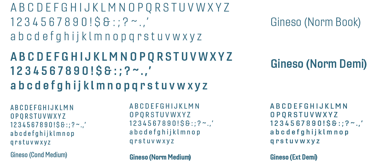
Typography
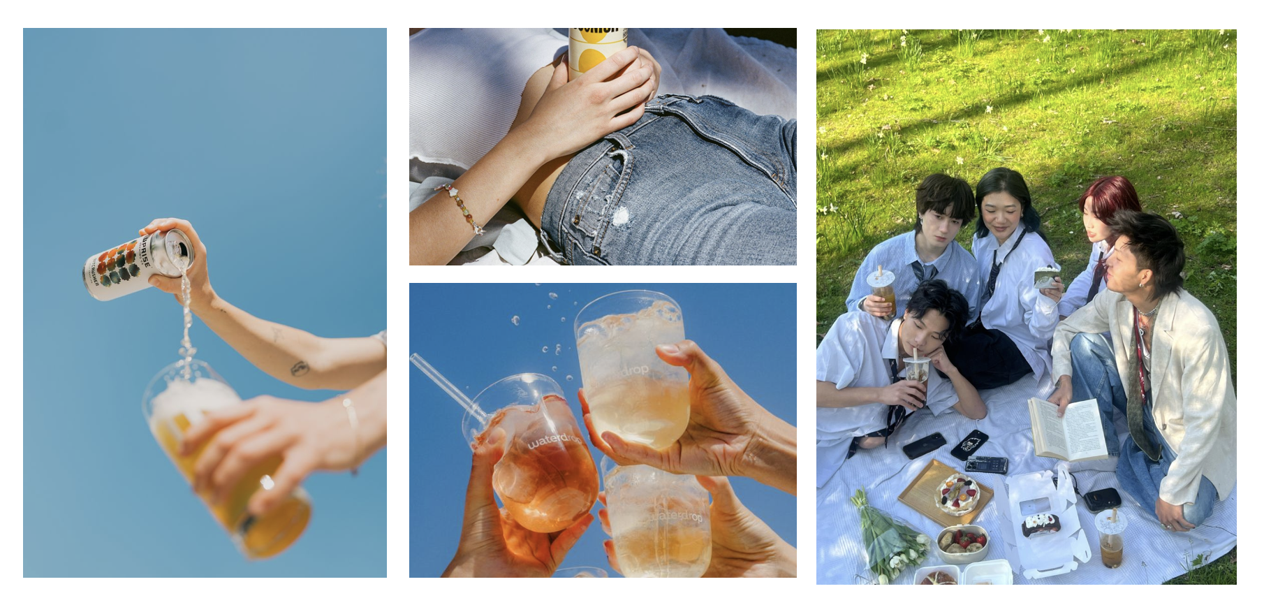
Photography
Patterns and Graphics
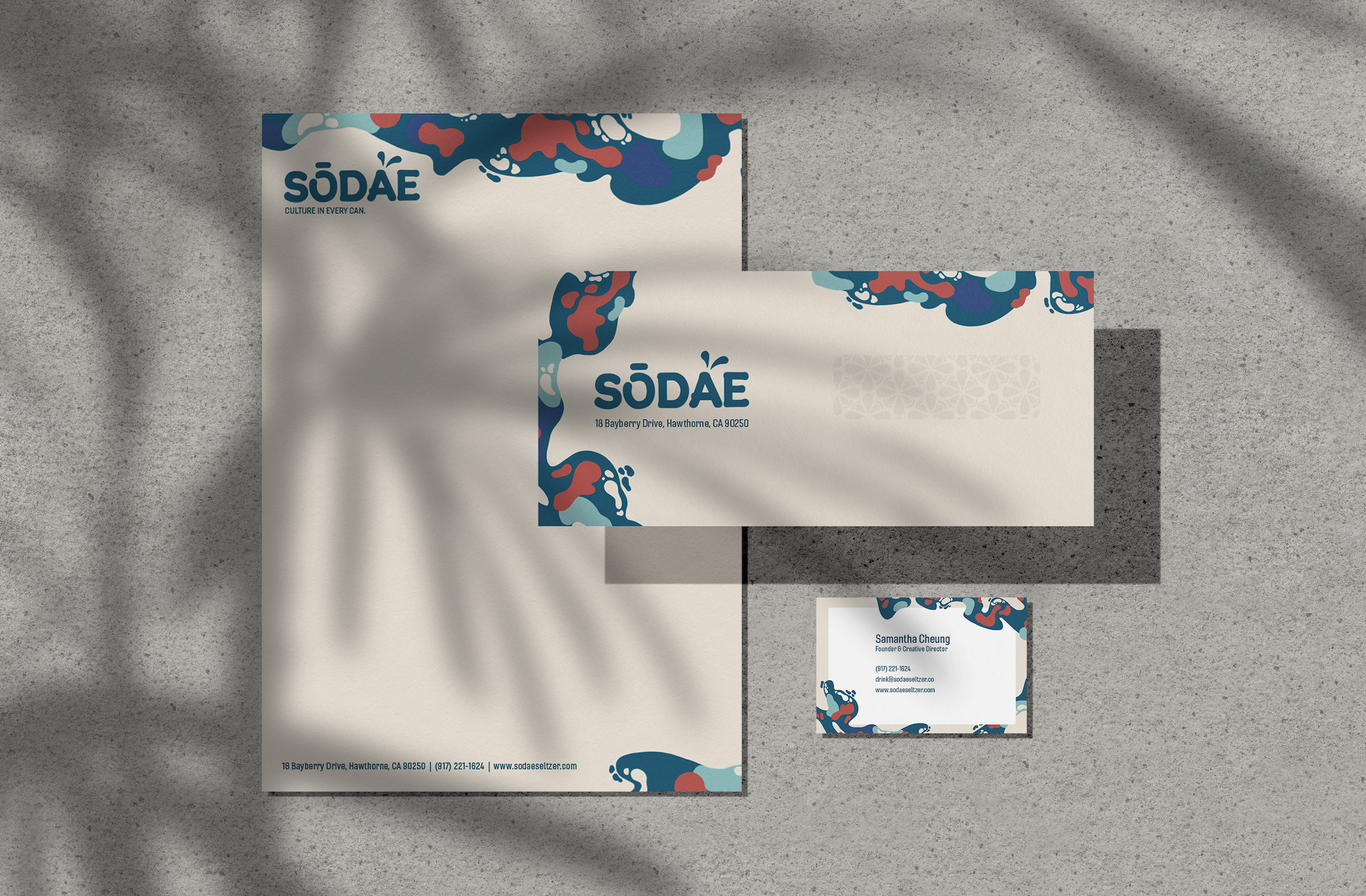
Stationery
Advertising Campaign
Merchandise
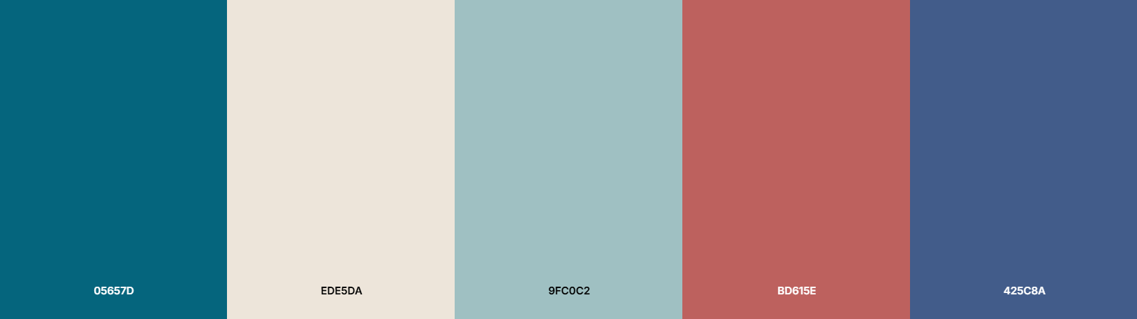
A modern, refreshing color palette that is centered around cool tones and warm accents for a clean, fresh, and playful feel.
4 Months
Figma, Adobe Photoshop, Adobe Illustrator, Adobe After Effects, Procreate
Brand Design, UI Design, Graphic Design, Prototyping
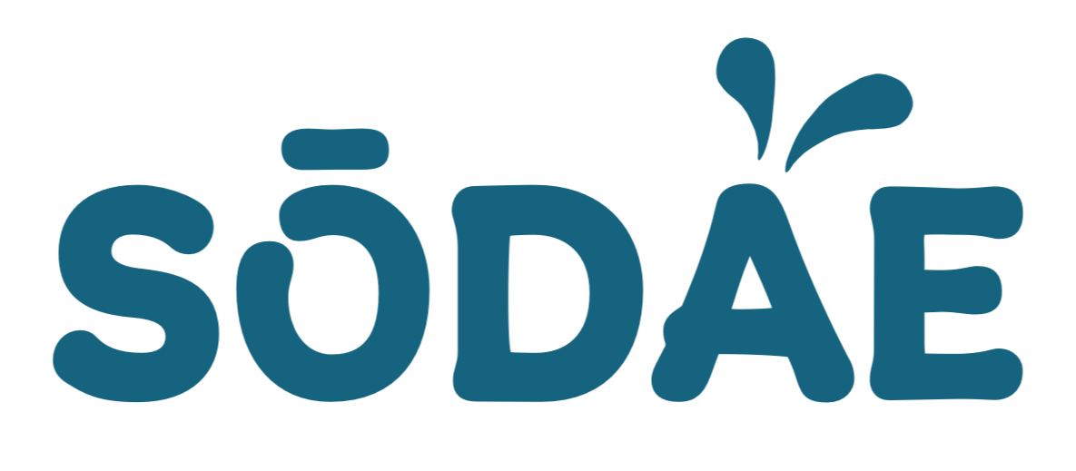
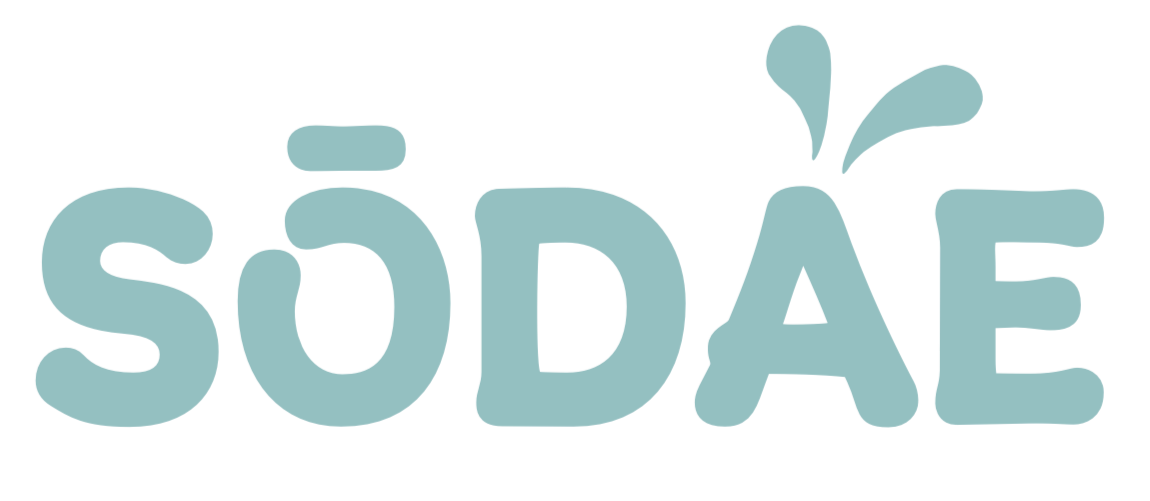
logo
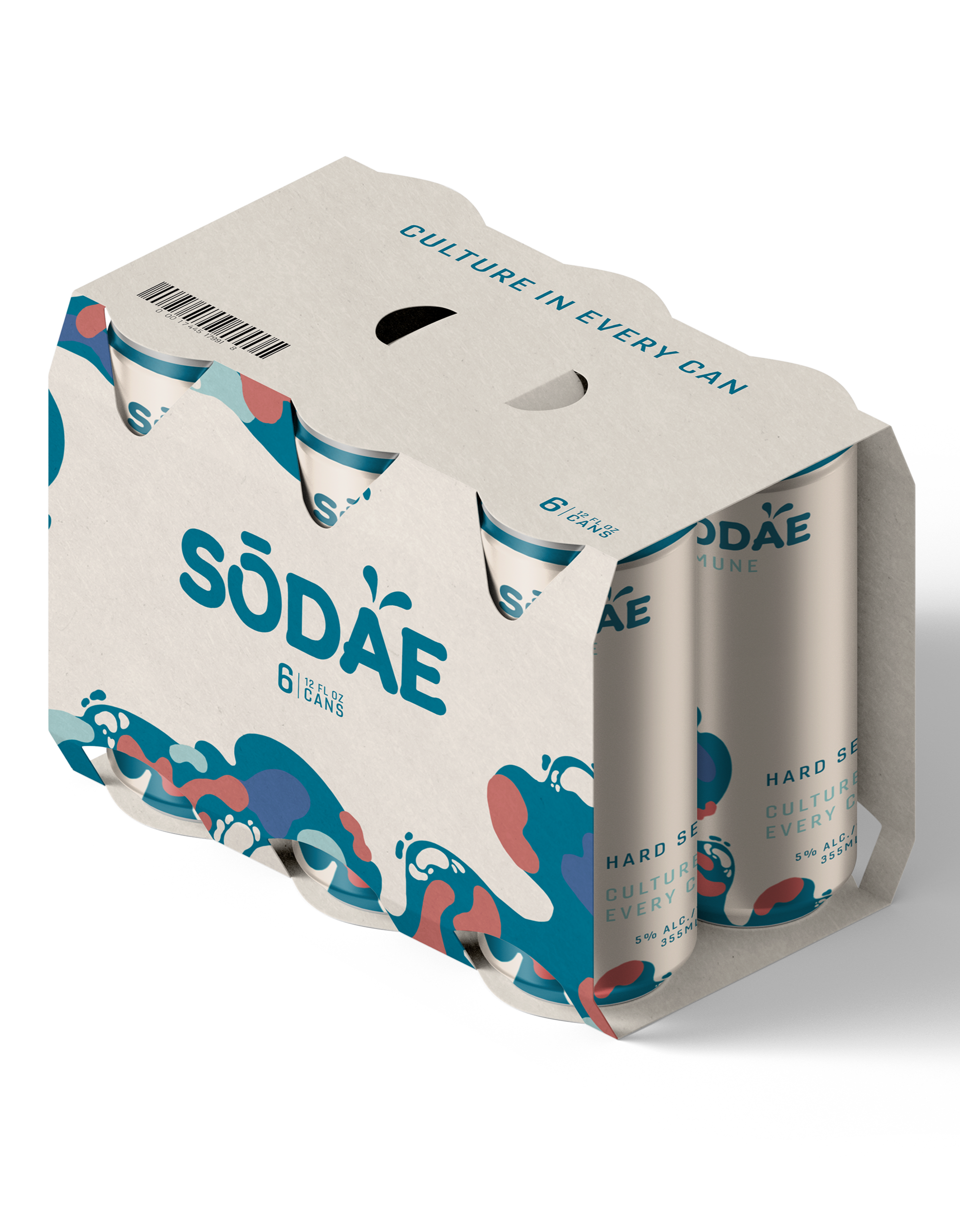
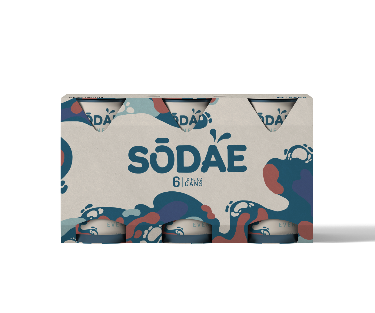
The SŌDAE logotype is the brand’s primary visual mark, appearing in a deep teal color. Its rounded uppercase lettering express characteristics of playfulness, while the water splashes above the “A” symbolizes the crisp nature of a hard seltzer drink. The secondary logo is designed to be used on darker backgrounds.
The photos captures bright, fun moments of connection and shared experience, highlighting vibrant outdoor settings and interactions between people.
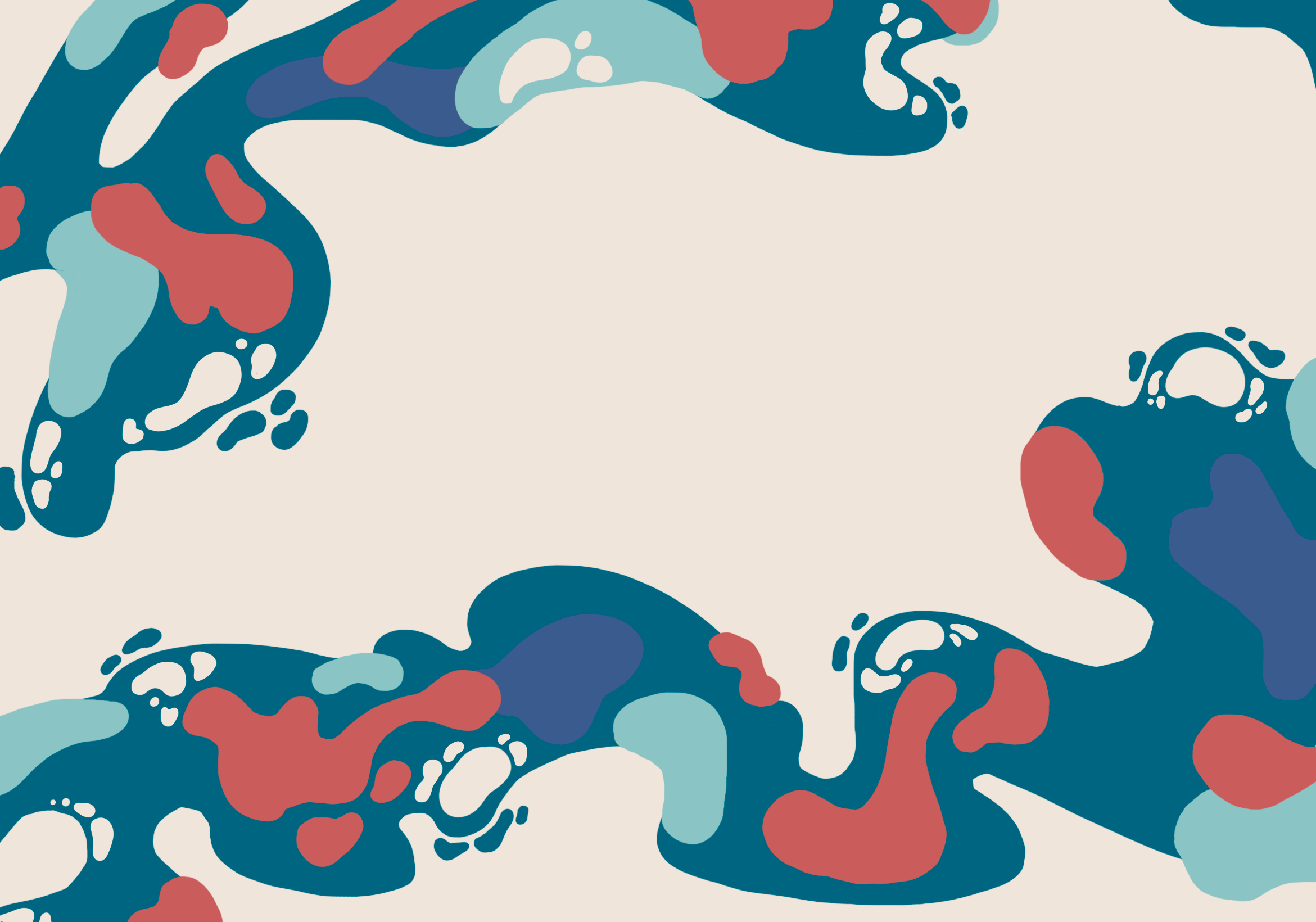
“Ebb” Graphic
“Bloom” Pattern
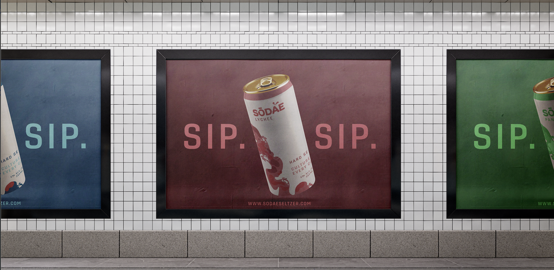
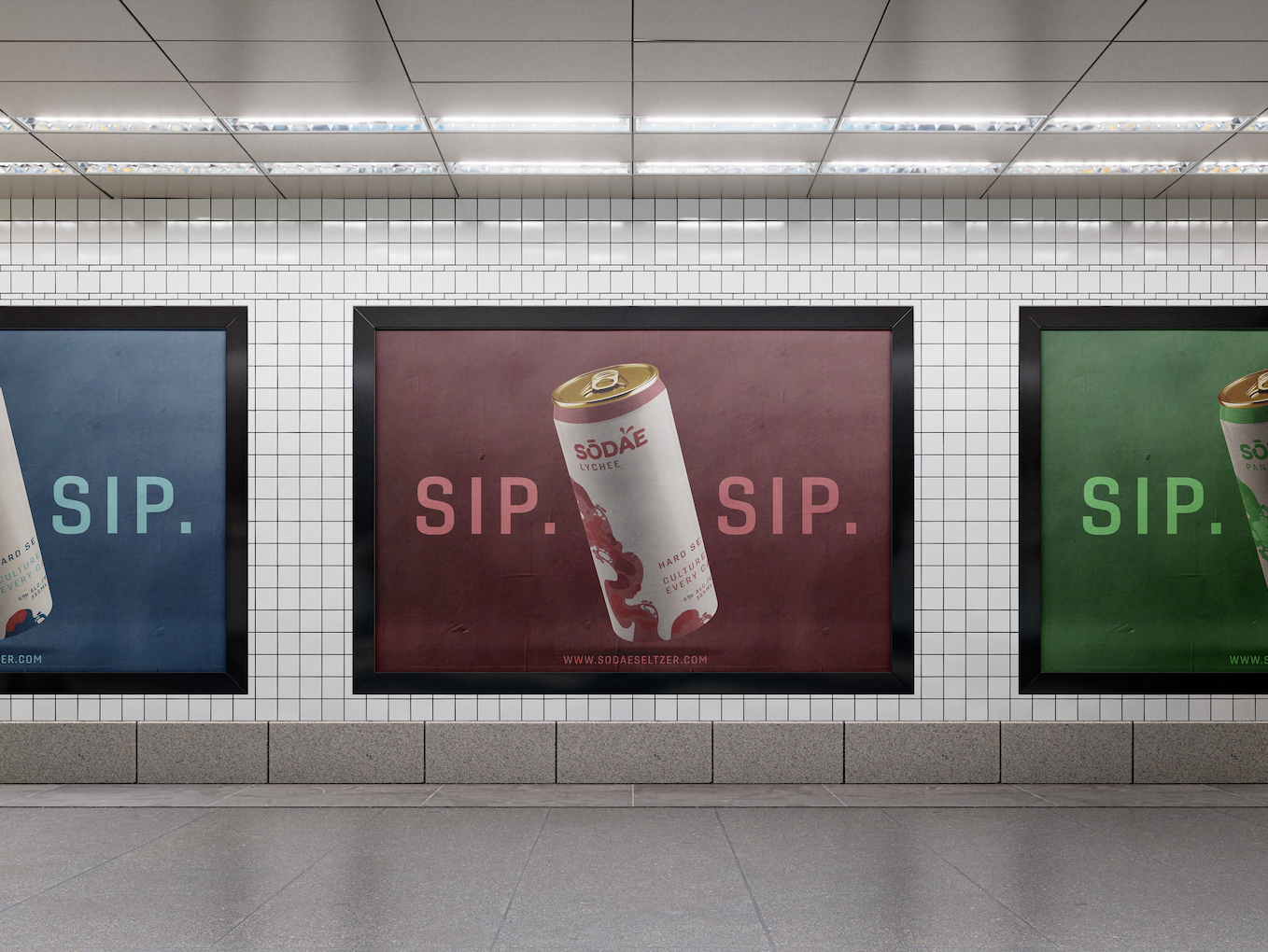
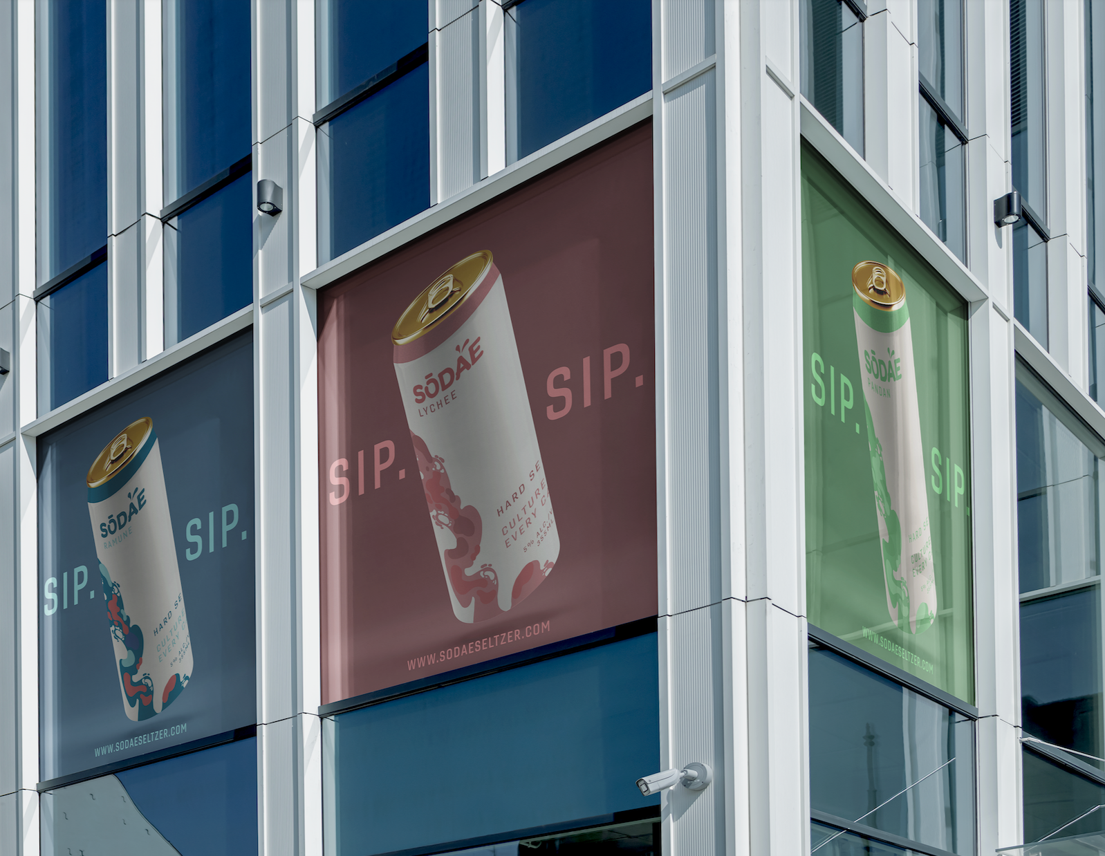
brand application
These posters are designed to be placed in high-traffic urban environments.
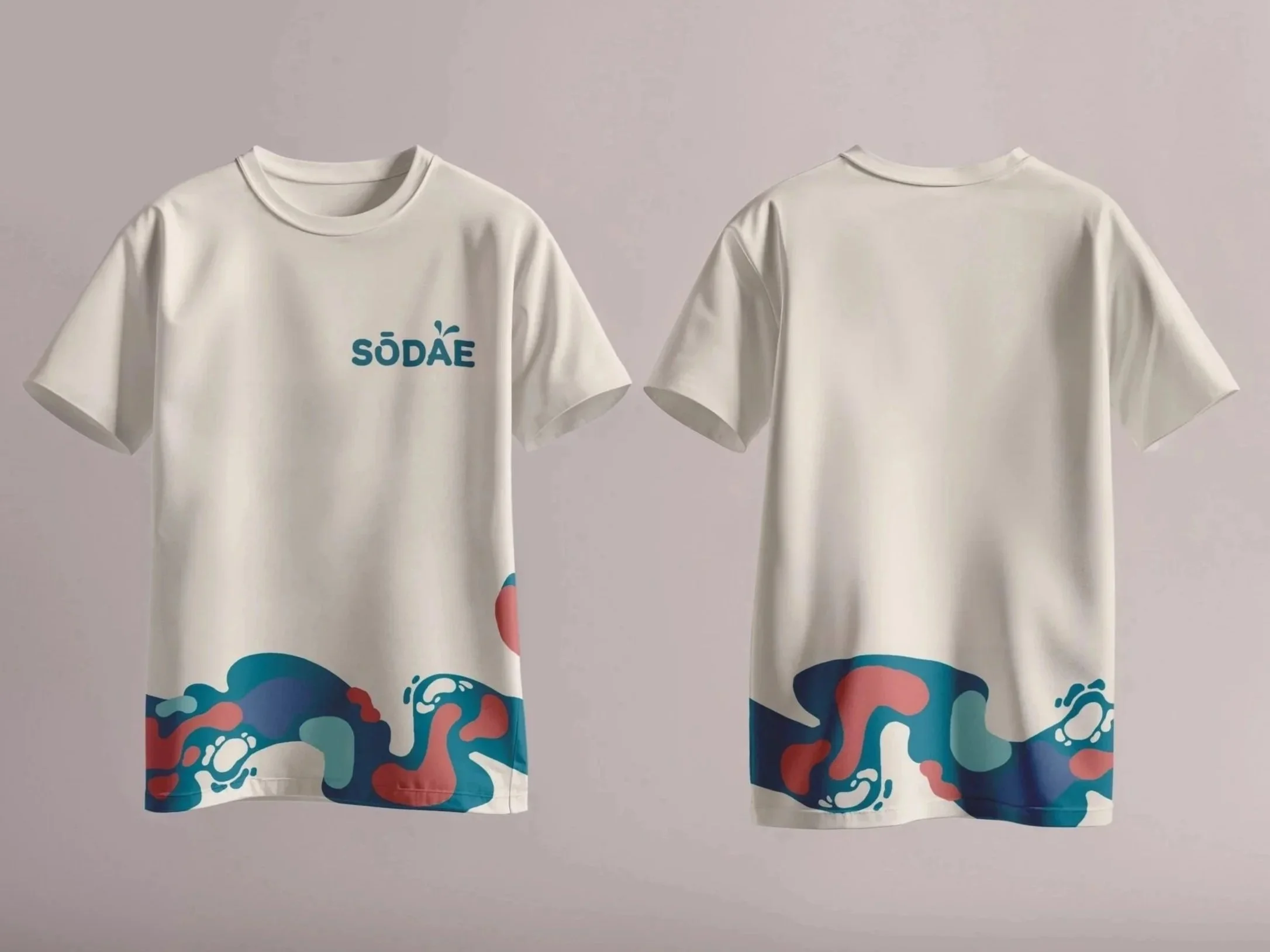
T-Shirts
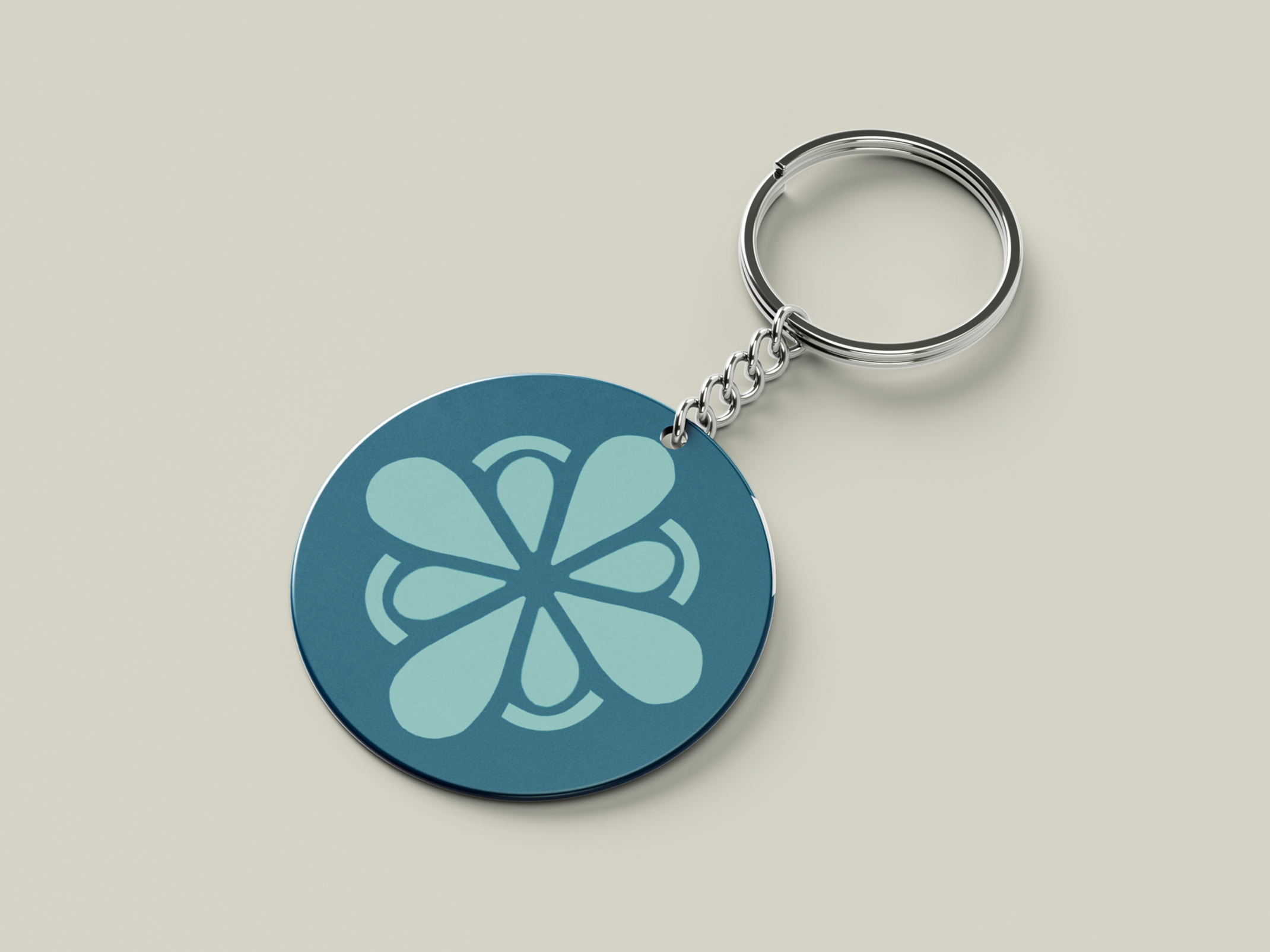
Keychain
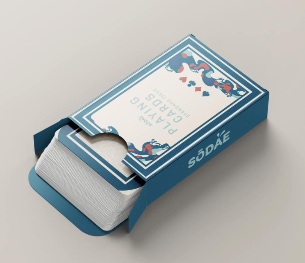
Playing Cards
Packaging
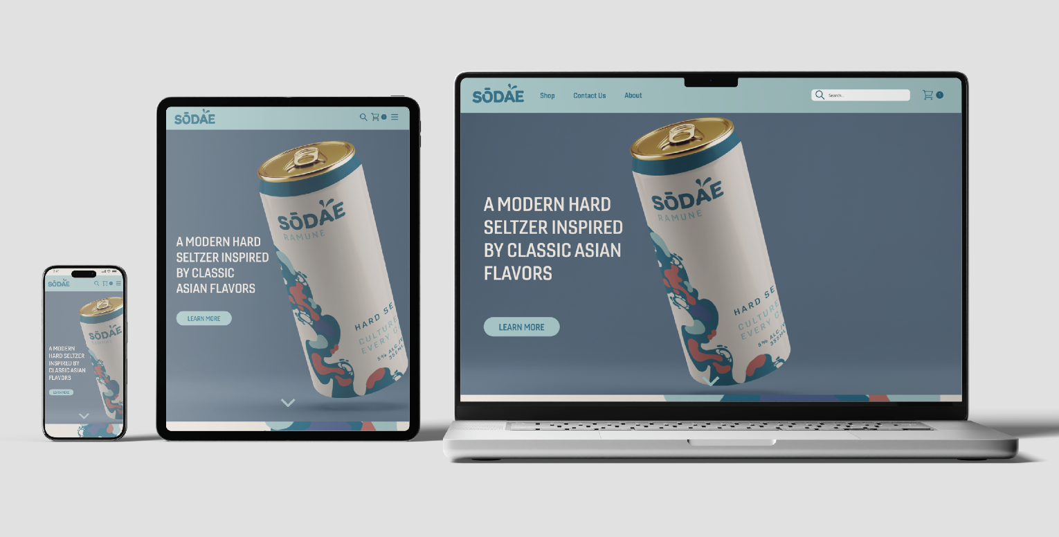
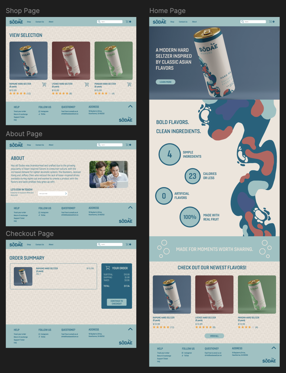
Web Design
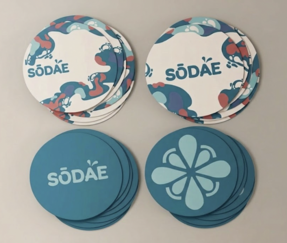
Coasters
ui design
LOGO ANIMATION
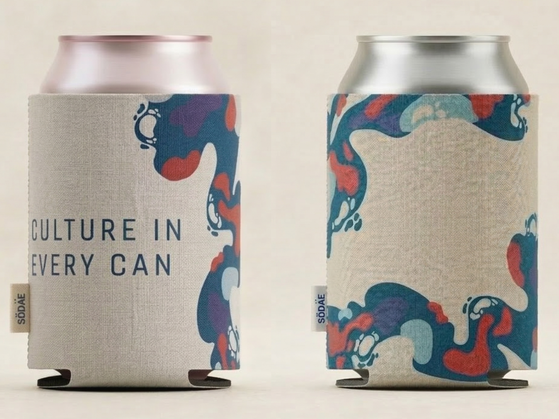
Koozies
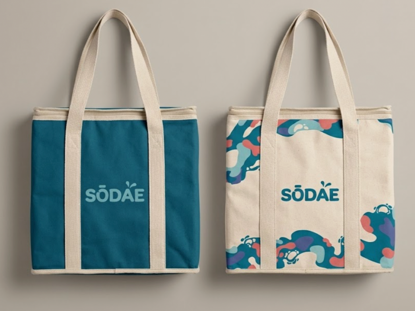
Cooler Bags
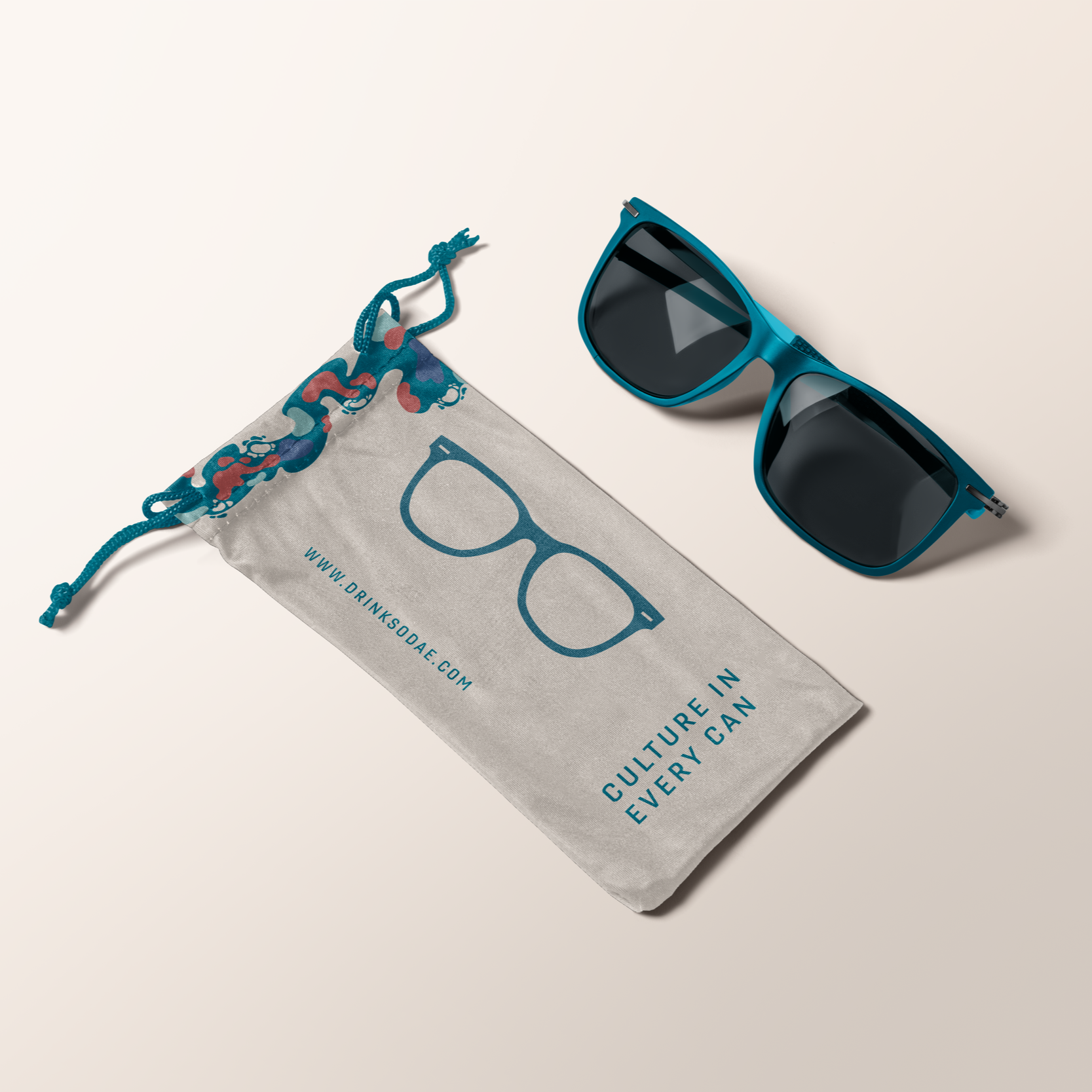
Sunglasses
visual style
Color Palette
you may also like
LIFESTYLE SUSTAINABILITY PROJECT
2024
POKÉMON COMPETITIVE ANALYSIS
2025
HOUSE OF JADE
2026
NOMAD
2026